
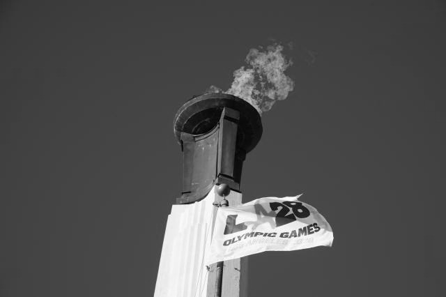
LA28 Unveils Bold, Superbloom-Inspired Look for Los Angeles Olympics
The 2028 Los Angeles Olympics on Tuesday unveiled its official visual identity, a vibrant design inspired by California’s superbloom , a rare phenomenon that occurs every 10–15 years in spring and blankets hills, valleys, and deserts with a stunning explosion of wildflowers .
The LA28 design team has applied the concept across all elements of the Games, including athlete credentials, staff uniforms, signage, competition venues , and the athletes’ village , creating a cohesive and visually striking experience. Designers also studied past Olympic and Paralympic Games , including the 1984 Los Angeles Olympics , to ensure the look blends tradition with contemporary style.
The primary colors are drawn from the city’s official flower, the orange Bird of Paradise , and the full Superbloom motif incorporates 13 blooms , reflecting the richness of California’s spring. The graphics were meticulously built on a precise grid , with visual density deliberately reduced near competition areas to maintain athlete focus and minimize distractions.
“We wanted the look to feel like Los Angeles itself ,” said Geoff Engelhardt , LA28 head of brand design. “LA is a city of incredible creativity, sitting at the intersection of sport and entertainment , and the Games will bring the world together here in 2028.”
The official design was showcased on Monday night at Intuit Dome , the venue for basketball in 2028 , where fans attending the Los Angeles Clippers game saw a digital display on the outdoor plaza’s giant screen, complemented by an indoor video unveiling the new look.
The LA28 visual identity promises a colourful, cohesive, and locally inspired aesthetic that will define the Games across venues and experiences, celebrating both California’s natural beauty and Los Angeles’ creative spirit .